This project is a redesign of the Target mobile app based on results from an observational study.
Observation Process and Findings
My team and I conducted an observational study of 10 adults, 5 of which reported using the Target app before and 5 who did not. We had the users complete several tasks with the existing Target app, including searching for items, adding them to the cart or shopping list, editing their shopping lists, and finding previous receipts and orders. We asked them for comments about the tasks and the overall layout of the app. We followed the Kansei method to identify common issues among all participants.
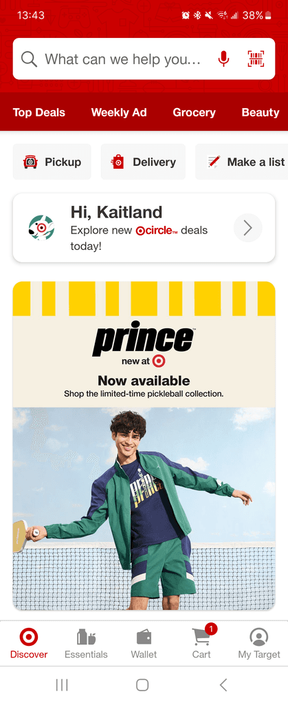
We found that 3 of the participants who reported never using the app before had difficulties locating digital receipts and previous purchases. Additionally, 5 of the users reported issues with locating previously purchased items to "repurchase" them. All of the returning users reported that they did not like that the ads on the homepage were not tailored to their previous purchasing habits and viewed the large banner ad as inconvenient. Finally, every user tried to use the "Essentials" button on the navigation bar to make a shopping list. The button actually lead them to preferences for same-day delivery options, and they overwhelmingly found it misleading. The Kansei words we extracted from the comments were "inconvenient," "faster," and "easier."
Goals
Our goal for the redesign was to increase usability of the app and reduce the time it took for users to complete their tasks. Additionally, we wanted to improve the user experience and make it feel more tailored to the user instead of a generic shared experience.
Solution
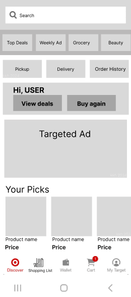
We redesigned the app's home page to provide easier access to previous purchases and commonly repurchased items in order to increase customer return rates and improve usability. We changed the "Make a list" button to provide easier access to Order History, as the participants did not select this option when creating a shopping list. We also changed the "Essentials" button to a "Shopping List" button since that is where all of our participants looked for the shopping list. Additionally, we reduced the size of the full page ad and marked it as space for a targeted ad. This allowed for targeted repurchases to be shown higher up on the screen and available when the user first opens the app. We also added two buttons to the greeting pane, since the users wanted a faster way to access repurchaseable items.

Original Live Screenshot from Target Mobile App
